
Building a Luxury Brand That Actually Looks Like Its Audience
The Fine Wine Series had built something real. Modeled after the cultural cachet of the Veuve Clicquot Polo Classic, it had carved out a coveted space for Black Millennials in the luxury events landscape — and the post-event imagery proved it. The energy was undeniable.
But when the COVID-19 pandemic brought live events to a halt, the brand faced a defining question: who are we when we're not in the room?
Without a cohesive identity system to anchor it, the brand's visual presence was inconsistent — strong photography carrying the weight of messaging that hadn't been fully defined. There was no governing logic connecting the graphics, the voice, or the experience. And at the center of it all was a logo that no longer reflected where the brand was headed.
The Fine Wine Series didn't just need a refresh. It needed an identity.
Before a single design decision was made, the existing brand was assessed across every touchpoint. What emerged was a clear pattern: the photography was doing all the heavy lifting. It communicated luxury, community, and aspiration — but none of that was codified anywhere. The moment you moved beyond the event imagery, the brand lost its signal.
Key gaps identified:
No logomark system with defined usage rules
No typographic hierarchy or brand voice guidelines
Inconsistent graphic language across digital and print assets
No framework for maintaining brand integrity as the brand scaled beyond live events
The photography proved the audience connection was there. The work was to build the architecture around it.
The pivot wasn't just operational — it was an opportunity to reposition. The Fine Wine Series had the credibility of an established event brand and the cultural resonance of a community institution. The strategy was to formalize both into a visual identity system that could hold its own in the luxury space without losing the cultural specificity that made it matter to its audience.
That meant building a brand that spoke two languages fluently: the quiet confidence of old-money luxury and the bold, intentional energy of Black excellence. Neither watered down for the other. Both fully expressed.
The logomark redesign anchored the refresh — giving the brand a mark it could build an entire system around rather than defaulting to photography to do the communicating.
Discovery
Audience mapping, competitive landscape review, and brand positioning. Defining what luxury means specifically to Black Millennials and where The Fine Wine Series sat within that cultural conversation.
Identity Architecture
Logomark exploration and refinement. Establishing the typographic system, color palette, and the visual grammar that would govern how all brand elements related to each other.
System Build
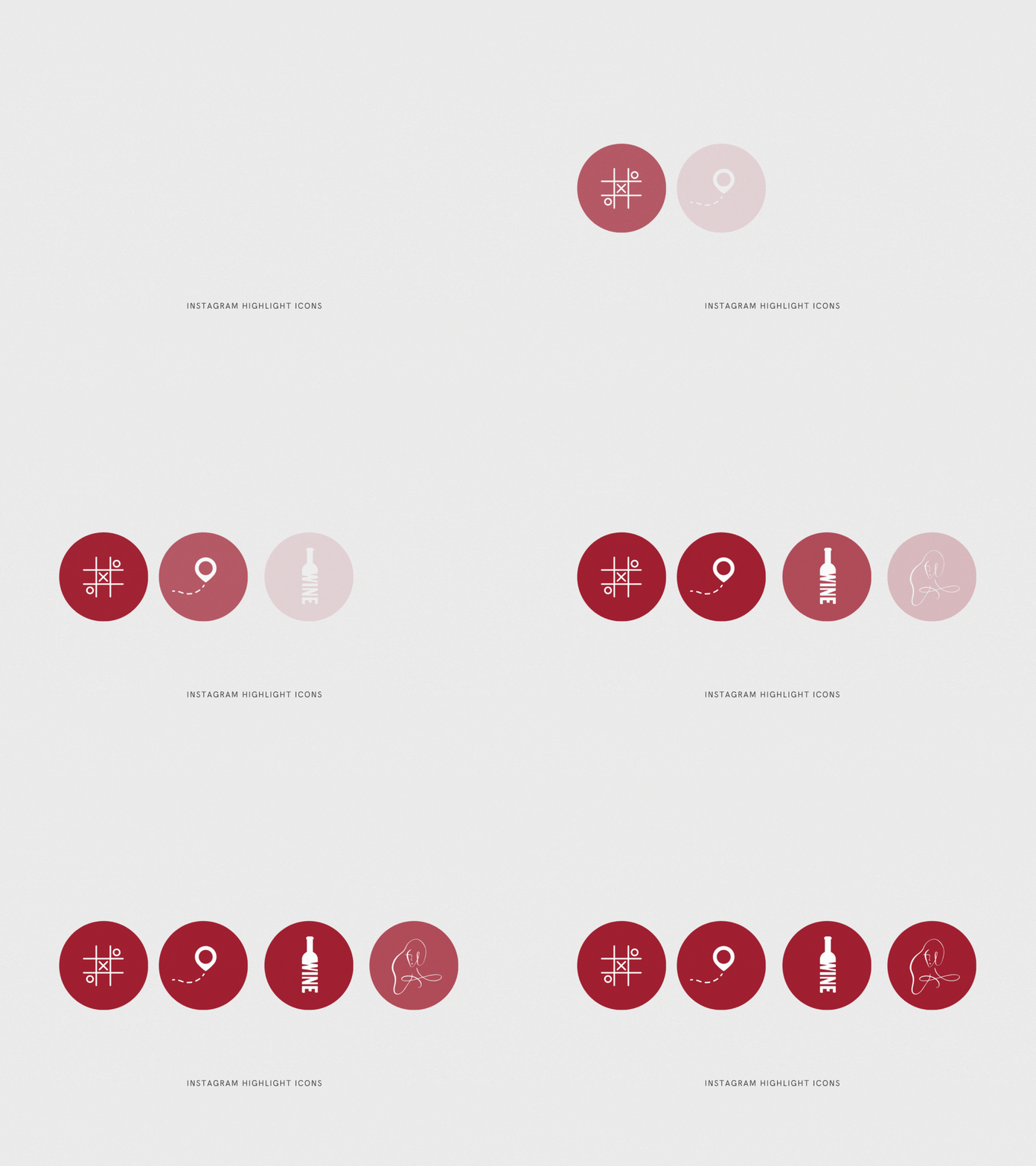
Translating the identity into a full brand system — usage rules, color specifications, typographic hierarchy, graphic elements, and application across digital and print touchpoints.
Brand Guidelines
Delivering a governance document that gave the client and any future collaborators the rules of the road — so the brand could grow without losing its integrity.
The Fine Wine Series launched the refreshed identity to an audience that had already shown up for them — and the new brand gave that audience something to hold onto beyond the event experience. The logomark became the anchor the brand had been missing. The system gave the team the language and tools to show up consistently across every channel, even when there were no events to photograph.
A brand built on a moment became a brand built to last.


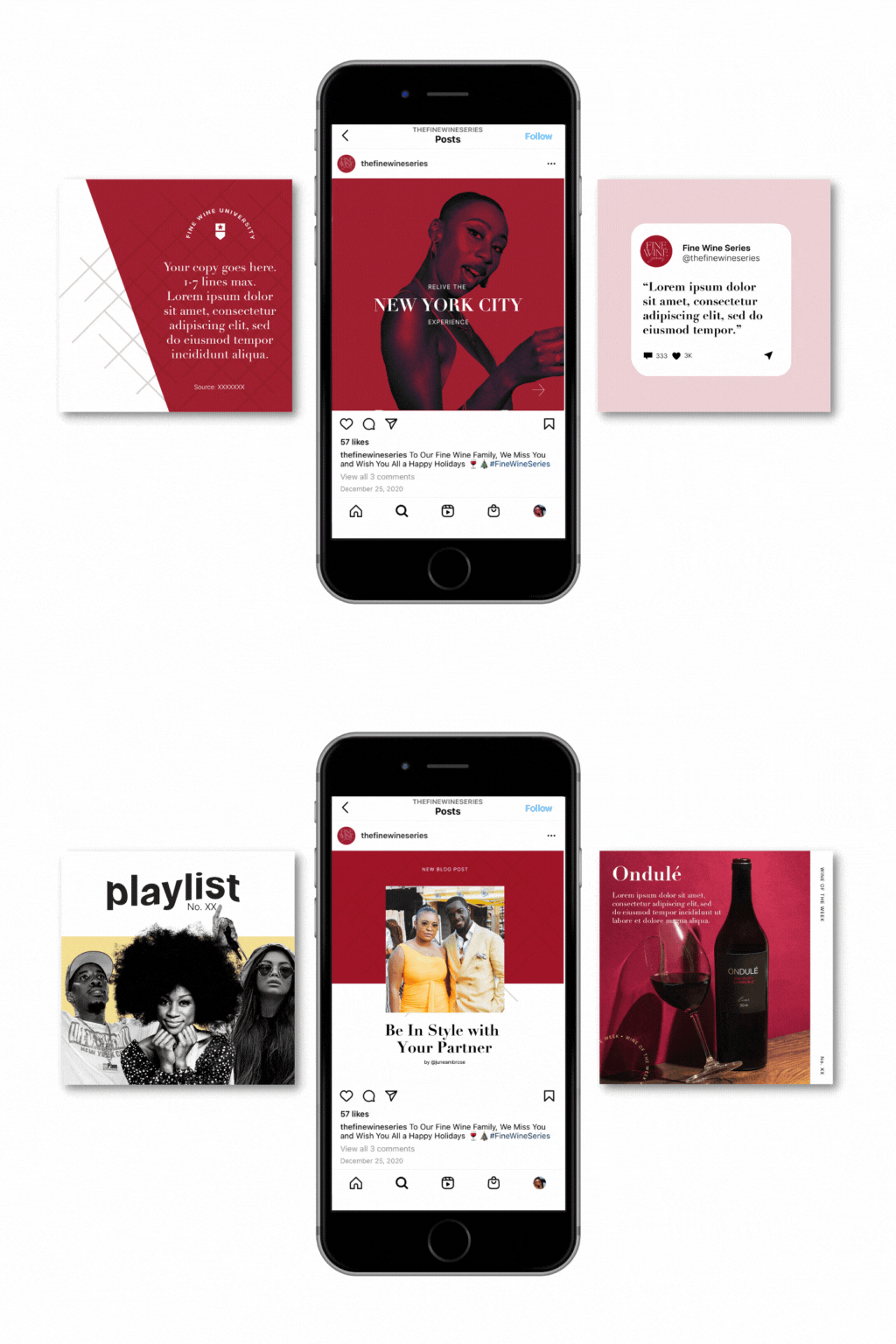


A crisis rarely creates a brand problem — it reveals one. The most resilient brands aren't the ones with the best moments. They're the ones with the clearest identity.
Building something for a culturally specific audience that deserves a premium experience?
Let's TalkA note on how I work: Every insight on this site reflects my own professional experience and original thinking. I use AI as an editing tool — to sharpen clarity and refine language — not as a ghostwriter. The ideas are mine. The voice is mine.